Finding the perfect wedding colour scheme is pivotal beyond mere decoration. It sets the emotional tone of your event, reflecting the personality and style of you and your partner.
The colours you select can influence the atmosphere of your celebration, affecting how your guests feel and interact throughout the day. Depending on your vision, a well-chosen palette can turn an ordinary location into a breathtaking spectacle, imbuing the occasion with warmth, elegance, or vibrancy.
The significance of colour selection extends to visual storytelling. Your wedding day reflects your love story, and your chosen colours contribute to the narrative you wish to share.
They can evoke feelings of romance, joy, and celebration and create a lasting impression in the memories of those who share in your special day. Moreover, the colours will be prominently featured in your wedding photographs and videos, playing a crucial role in remembering and revisiting your wedding in the years to come.
The choice of colour for your wedding reception is a powerful tool in crafting the desired ambience and making your wedding uniquely yours. It's an opportunity to creatively express your style and the essence of your relationship, ensuring that your celebration is visually stunning and emotionally resonant.
Table of Contents
The Emotional Impact of Colours
Drawing inspiration from the essence and emotional impact of colours, this blog explores how hues can profoundly influence the ambience and emotional tone of significant events, particularly weddings. Colours are not just visual elements; they are words that move us emotionally, evoking a spectrum of feelings and setting the mood for life's most cherished moments.
The Whisper of Whites
White, the quintessential wedding colour, symbolises purity, innocence, and new beginnings. It's a canvas that invites creativity, embodying simplicity and elegance. White's versatility allows it to be a foundation for any theme, from the classic to the contemporary, making it a timeless choice that speaks of fresh starts and clean slates.
The Joy of Yellows and Oranges
Yellow, with its sunny disposition, brings warmth and happiness to any setting. It's the colour of wisdom, imagination, and adventure, perfect for couples with a bright, optimistic outlook. Orange, a vibrant blend of red's passion and yellow's joy, infuses weddings with enthusiasm, creativity, and playful energy. These colours are ideal for those envisioning their day filled with laughter, warmth, and spirited conversations.
The Passion of Reds and Pinks
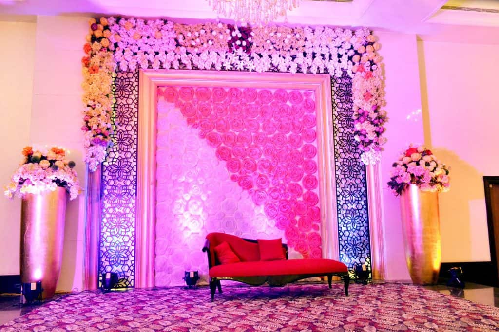
Red, the colour of love and passion, adds drama and intensity to wedding palettes. It's a bold choice that symbolises strength, vitality, and the courage to pursue one's dreams. Pink, red's softer sibling, brings a sense of romance and sweetness, embodying love's gentle and nurturing aspects. Whether the deep hues of burgundy or the soft blush of pink, these colours create an atmosphere of heartfelt emotion and romantic elegance.
The Tranquility of Blues and Greens
Blue, the colour of tranquillity and peace, brings a serene and calming presence to any celebration. It speaks of loyalty, depth, and stability, making it a perfect choice for couples. Green, the colour of nature, symbolises growth, harmony, and renewal. It's a refreshing hue that connects the event to the natural world, embodying balance and a sense of groundedness.
The Elegance of Purples
A colour frequently linked with majesty and nobility enhances the occasion with an air of mystique and opulence. It's a choice for the unconventional, symbolising creativity, dignity, and pride. Lighter shades of purple, such as lavender, evoke romantic and nostalgic feelings, perfect for creating a dreamy, fairy-tale ambience.
The Warmth of Earth Tones
Brown and its variants bring a comforting, earthy quality to weddings. Brown tones ground the celebration in simplicity and warmth, symbolising stability, reliability, and resilience. They are a nod to the enduring nature of love, offering a solid foundation to build a lifetime of memories.
The Sophistication of Blacks, Grays, and Metallics
Black and grey add sophistication and modernity, speaking to those who appreciate the timeless elegance and a touch of mystery. Metallics like gold and silver introduce a sense of glamour and festivity, reflecting the light of joy and celebration. Whether used as main themes or accents, these colours lend a refined and distinguished air to the event.
The emotional impact of colours in weddings cannot be overstated. They are the silent language that sets the stage, evokes moods, and expresses the couple's personality and journey. Choosing the right colours for your wedding is a deeply personal decision that reflects your shared dreams, values, and the essence of the love you celebrate.
Colour Themes and Seasonal Considerations
When planning an event, the choice of colour theme is pivotal, not just for aesthetic coherence but also for embodying the season's essence. This is especially true for weddings, where the colour palette sets the mood and highlights the couple's personality. Let's delve into selecting the perfect colour themes while considering seasonal nuances, ensuring your event is timeless and in tune with the natural backdrop.
Understanding the Venue's Palette
An important factor in determining your colour scheme. Before locking in your decorations, assess the venue's inherent colours and style. A rustic winery calls for a different palette than a modern gallery space. For instance, a venue with lush greenery complements earth tones and vibrant greens, while a seaside location might inspire a palette of blues, sandy neutrals, and coral accents. The goal is to harmonise your theme with the venue's character, creating a seamless aesthetic flow.
Seasonal Inspirations
Each season brings its own colour story, influencing the mood and style of your event. Here's how to align your colour choices with the time of year:
- Spring: Embrace soft pastels like blush, lavender, and mint, reflecting the season's fresh blooms and gentle warmth. These colours pair beautifully with creamy neutrals and metallic accents for a touch of elegance.
- Summer: Bold and vibrant hues such as coral, turquoise, and sunshine yellow capture the lively spirit of summer. These colours work well with crisp whites and natural textures, evoking a sense of sunny days and clear skies.
- Autumn: Rich, earthy tones like burgundy, burnt orange, and deep teal mirror the changing foliage. Complement these with gold or copper metallics for a warm, cozy feel that is perfect for fall celebrations.
- Winter: Cool tones like icy blue, silver, and frosty lavender paired with rich jewel tones create a magical winter wonderland theme. Add sparkling accents and soft, fluffy textures to the festive cheer.
Colour Coordination Tips
- Start with the Venue: Let the venue's colour and style guide your initial palette choices.
- Consider the Season: Choose colours that resonate with the season's natural landscape and mood.
- Balance with Neutrals: Incorporate neutral tones to balance brighter or deeper colours, ensuring a harmonious palette.
- Accent with Metallics: Gold, silver, and copper accents can elevate your colour scheme, adding a touch of luxury and depth.
- Personalise: Ultimately, the colours should reflect your style and the atmosphere you want to create.
Selecting a colour theme that harmonises with your venue and the season can transform your event into an unforgettable experience. Together, these components allow you to construct a cohesive and beautiful celebration that resonates with the natural beauty of the time of year and the unique charm of your chosen setting.
Remember, the best colour palette feels true to you and your celebration. Let the seasons inspire you, but make the theme your own by incorporating personal touches and favourite hues.
Top Colour Choices for Wedding Receptions
Taking cues from enduring style and current fashion, here's a unique and comprehensive guide to the top colour choices for wedding receptions. This guide combines insights from three reputable sources to help you choose the perfect palette for your special day.
Gold: A Timeless Elegance
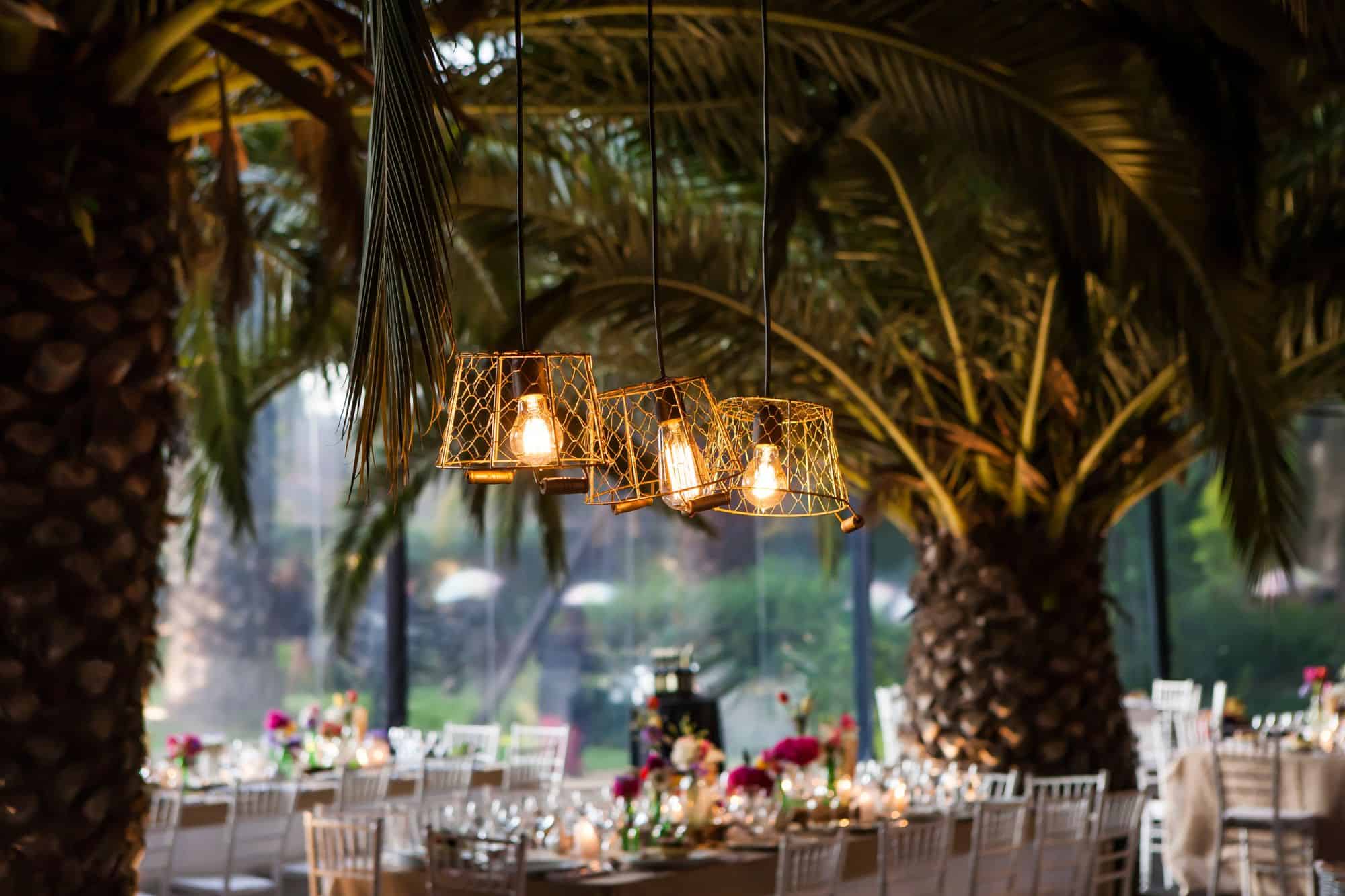
Gold remains a top choice for wedding receptions, exuding elegance and versatility. It pairs beautifully with various colours, from bold hues to soft pastels, making it perfect for any season or theme. Whether planning a glamorous ballroom event or a rustic outdoor gathering, gold adds a touch of sophistication and warmth.
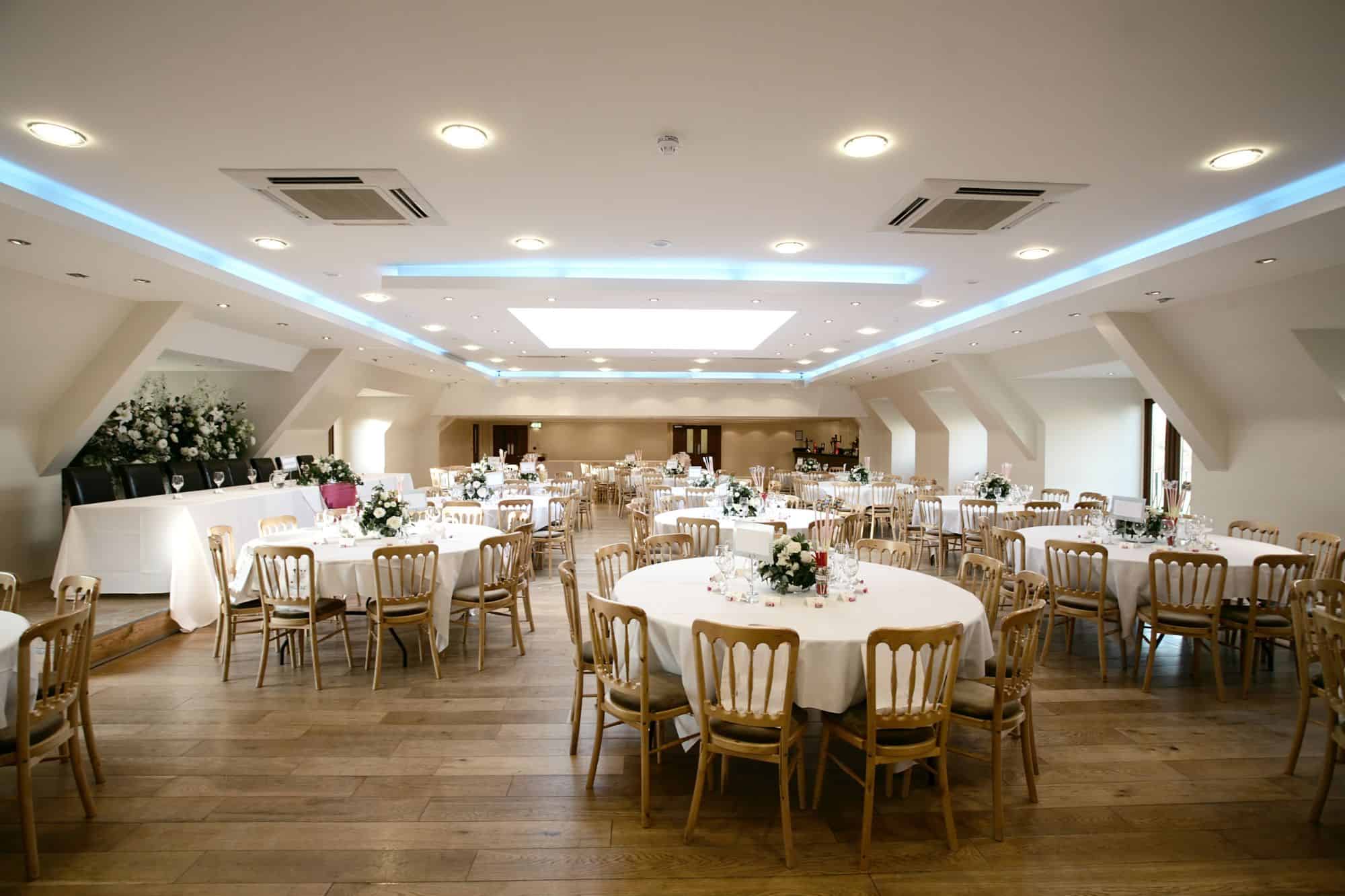
Ivory, Champagne, and White: Classic Neutrals
Consider a palette of ivory, champagne, and white for a chic and timeless look. These colours offer a soft, romantic backdrop that can be accented with metallics or pops of colour for a more personalised touch. Perfect for any venue, these hues create an inviting, stylish, sophisticated atmosphere.
Dark Blue: Deep and Dramatic
Dark blue, including navy and midnight blue, is a classic yet bold choice for wedding receptions. It can be paired with lighter blues for a monochromatic scheme or jewel tones like burgundy and emerald for a dramatic effect. Dark blue is ideal for creating an elegant, timeless look that's also striking and memorable.
Light Pink and Blush: Soft and Romantic
Light pink and blush remain popular choices for their soft, romantic appeal. These versatile colours work well for spring weddings or are paired with darker hues for fall and winter events. Consider a palette combining light pink with magenta for a playful vibe or brown and orange tones for a boho-chic look.
Green: Vibrant and Versatile
Green, in its light and dark shades, has emerged as a wedding favourite. Light greens like sage and pistachio offer a fresh, airy feel, while darker greens like emerald add depth and richness. Green works well across all seasons and can be easily incorporated into various aspects of your wedding decor, from floral arrangements to table settings.
Seasonal Inspirations
- Fall: Embrace the season's natural palette with tawny browns, pine greens, and gold accents. These colours reflect the warmth and beauty of autumn and work well with rustic themes.
- Winter: For a winter wonderland theme, consider combinations of deep reds, greens, and neutral tones like grey and cream. Metallic embellishments made of silver or gold can bring a festive touch.
- Summer: Bright and sunny palettes with mint green, eggshell, and vibrant pastels capture the essence of summer. These colours are perfect for outdoor weddings and can be complemented with floral arrangements featuring seasonal blooms.
- Spring: Soft pastels like pink, green, and gold symbolise new beginnings and work beautifully for spring weddings. These colours can be paired with fresh florals to create a light, airy feel that's perfect for the season.
Personalising Your Palette
Remember, the most important aspect of choosing your wedding colours is that they reflect your style and the mood you want to set for your special day. Feel free to mix and match colours and textures to create a palette that's uniquely yours. Whether you draw inspiration from a favourite piece of art, the season, or the venue, your wedding colours can be a beautiful expression of your love story.
Conclusion
The choice of colour for a wedding reception is crucial as it sets the emotional tone of the event, reflecting the personality and style of the couple. The colours chosen can influence the atmosphere of the celebration, affecting how guests feel and interact throughout the day. The significance of colour selection extends to visual storytelling, as your wedding day reflects your love story and contributes to the narrative you wish to share.
The emotional impact of colours at weddings cannot be overstated, as they are not just visual elements but words that move us emotionally, evoking a spectrum of feelings and setting the mood for life's most cherished moments. Whites, for example, symbolise purity, innocence, and new beginnings, while yellows and oranges bring warmth and happiness.
Reds and pinks symbolise love and passion, while blues and greens symbolise tranquillity and peace. Purples enhance the occasion with mystique and luxury, while earth tones bring comfort and warmth. Blacks, greys, and metallics add sophistication and modernity, while metallics like gold and silver introduce a sense of glamour and festivity.
Choosing the right colours for a wedding is a deeply personal decision that reflects your shared dreams, values, and the essence of the love you celebrate. Seasonal considerations are also important when selecting the perfect theme, as the colour palette sets the mood and highlights the couple's personality.
Seasonal inspirations play a significant role in influencing the mood and style of an event. To create a harmonious colour scheme, start with the venue's colour and style, consider the season, balance with neutrals, and accent with metallics. Personalise the colour palette to reflect your style and the atmosphere you want to create.
Top colour choices for wedding receptions include gold, ivory, champagne, white, dark blue, light pink and blush, and green. Gold exudes elegance and versatility, while ivory, champagne, and white offer a chic and timeless look. Dark blue is a deep and dramatic choice, while light pink and blush are soft and romantic. Green is vibrant and versatile, offering a fresh, airy feel and adding depth.
Seasonal inspirations include autumn, winter, summer, and spring. Fall colours reflect the warmth and beauty of autumn, while winter colours create a winter wonderland theme. Summer colours with mint green, eggshell, and vibrant pastels capture the essence of summer, while spring colours symbolise new beginnings.
Choosing the right wedding colours is crucial, as they should reflect your style and mood. Mix and match colours and textures to create a look that is uniquely yours, expressing your love story and bringing your event to life.
Content Summary
- The selection of colours for a wedding reception is critical, as it shapes the event's emotional tone, reflecting the couple's personality and style.
- The chosen colours influence the celebration's atmosphere, affecting guests' feelings and interactions.
- A well-selected palette can transform a location, adding warmth, elegance, or vibrancy to the occasion.
- Colour choice is significant in visual storytelling, reflecting the couple's love story and the narrative they wish to share.
- The chosen colours evoke romance, joy, and celebration, creating lasting memories for attendees.
- Wedding colours are prominently featured in photographs and videos, playing a key role in reminiscing about the day.
- Selecting wedding reception colours allows for a creative expression of style and relationship essence.
- Colours are not just visual elements but evoke a spectrum of feelings, setting the mood for life's cherished moments.
- White symbolises purity, innocence, and new beginnings, offering a versatile foundation for any theme.
- Yellow brings warmth and happiness, symbolising wisdom, imagination, and adventure.
- Orange combines red's passion and yellow's joy, infusing weddings with enthusiasm and playful energy.
- Red, symbolising love and passion, adds drama and intensity, while pink offers romance and sweetness.
- Blue brings tranquillity and peace, representing loyalty, depth, and stability.
- Green symbolises growth, harmony, and renewal, connecting the event to the natural world.
- Linking with majesty and nobility, purple adds charisma and luxury to the occasion.
- Earth tones like brown symbolise stability, reliability, and resilience, grounding the celebration in warmth.
- Blacks, greys, and metallics add sophistication and modernity, with metallics introducing glamour.
- Choosing wedding colours is a deeply personal decision reflecting shared dreams, values, and love.
- Seasonal considerations are crucial in selecting the perfect colour theme, embodying the season's essence.
- Assessing the venue's inherent colours and style is important before finalising the decoration palette.
- Each season brings its own colour story, influencing the event's mood and style.
- Spring favours soft pastels, reflecting fresh blooms and gentle warmth.
- Summer's vibrant hues capture the lively spirit of the season, working well with crisp whites and natural textures.
- Autumn's rich, earthy tones mirror the changing foliage, complemented by metallics for a cozy feel.
- Winter's cool tones and rich jewel tones create a magical wonderland theme, enhanced by sparkling accents.
- Venue colours and styles should guide initial palette choices, with the season influencing final selections.
- Incorporating neutral tones balances brighter or deeper colours for a harmonious palette.
- Metallic accents like gold, silver, and copper add luxury and depth to the colour scheme.
- Personalising the palette ensures it reflects the couple's style and the desired atmosphere.
- Gold remains a top choice for wedding receptions, offering elegance and versatility.
- Ivory, champagne, and white provide a chic, timeless backdrop, adaptable with metallics or colour pops.
- Dark blue, including navy and midnight blue, offers a deep and dramatic choice, pairing well with lighter blues or jewel tones.
- Light pink and blush are favoured for their soft, romantic appeal and versatility across seasons.
- In light and dark shades, green has emerged as a wedding favourite for its freshness and depth.
- Autumn weddings embrace tawny browns, pine greens, and gold accents, reflecting the season's warmth.
- Winter weddings may feature deep reds, greens, and neutral tones with metallic embellishments.
- Summer weddings favour bright, sunny palettes with mint green, eggshell, and vibrant pastels.
- Spring weddings benefit from soft pastels like pink, green, and gold, symbolising new beginnings.
- The choice of wedding colours reflects the couple's style and the mood they wish to create.
- Mixing and matching colours and textures allows for a uniquely personal palette.
- The selection process should consider the venue, season, and desired emotional tone.
- Gold adds sophistication and warmth to any wedding theme, from glamorous to rustic.
- Ivory, champagne, and white create an inviting, stylish atmosphere that is adaptable to any venue.
- Dark blue is a timeless choice that's elegant and memorable, suitable for various themes.
- Light pink and blush offer flexibility for spring weddings or combined with darker hues for other seasons.
- Green's versatility makes it a popular choice, easily incorporated into decor and floral arrangements.
- Seasonal inspirations influence colour choices, ensuring the event aligns with the natural beauty of the time.
- Personal touches and favourite hues uniquely make the couple's theme, expressing their love story.
- The best wedding palette, incorporating personal and seasonal inspirations, feels true to the couple.
Frequently Asked Questions
Selecting one or two main colours and one or two accent colours to create depth and interest is best.
Absolutely! Mixing warm and cool tones can add contrast and vibrancy to your colour scheme.
Consult with your photographer and possibly do a test shoot with your colours, especially if you choose bold or unusual combinations.
Look for inspiration in your venue, season, or favourite elements from other weddings and consult with a designer for professional advice.
While it's okay to change your mind, finalising your colours early in the planning process is best to ensure a cohesive look.